It’s easy to think app engagement hinges on push notifications and alerts once a user has installed an app and completed their first purchase.
But any great product manager knows user retention begins at onboarding.
Think about your favorite app experiences: From ride-sharing apps like Lyft to dating apps like Bumble and Tinder, the seamless onboarding these apps created gave you the knowledge you needed to get the most out of the app’s feature set immediately – and a reason to return and engage again.
Moreover, considering the amount of money spent on user acquisition, a weak onboarding experience is a missed opportunity to ensure your acquired users are retained.
The App Churn Challenge
Let’s look at some stats around churn and retention that underscore why effective onboarding is so important:
- 86% of new mobile users don’t return after their initial install, according to Appcues.
- 71% of all app users churn within 90 days, according to Localytics.
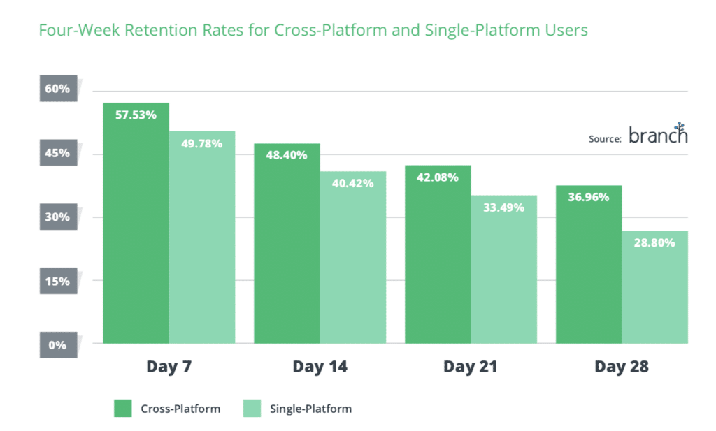
- While cross-platform users have a lower churn rate than their single-touchpoint counterparts, Branch data found retention rates decline for both user sets over the course of four weeks.
One way to combat this churn and retain acquired users: Onboard them effectively to make sure they recognize the value in your app as soon as possible.
App Onboarding: What Is It & How Can It Reduce User Churn?
First, let’s talk about what we mean by onboarding. Onboarding was a term originally used by Human Resources departments. UX designers and product managers lifted the phrase and used it to describe the first interactions a user has within an app. It’s a critical component of ensuring first-time users become loyal app advocates.
Onboarding: How Important Is It For Your App?
Now, before we dive into how to create a great onboarding experience, let’s address whether onboarding makes sense for your app. Not all apps are created equal – and if your app is simple and self-explanatory, onboarding could be overkill. But there are a few sure signs you’ll need a solid onboarding flow:
- Complicated Interactions
Introducing a new interaction on your app, like shaking or swiping in another direction? Onboarding screens help train users to embrace this new functionality. Great example: Dating app Bumble instructs users to shake their phone to backtrack to profiles they accidentally swiped “no” on. Since this is a new way to use the phone – and a new feature – this screen helps make sure users know it is available.
- Data Input
For banking and financial institutions (and more), onboarding is critical because users will be populating empty fields with their data. A simple rule of onboarding: If users are inputting sensitive information, dedicate at least one screen to explaining how requested data will be used. - Major Redesign
Launching a new app design? Switched the location of a key section in the app navigation? These are all great times to lean on onboarding to communicate these changes to users so they don’t get lost.
While these examples showcase critical times in the onboarding process, product managers and designers tasked with creating a great onboarding experience for new users still have their work cut out for them. A cookie-cutter, one-size-fits-all approach to onboarding is sure to fail – and what worked in the examples above might not be right for your users.
Now, let’s take a look at five ways to ensure your onboarding flow drives users to engage and re-engage to drive key KPIs.
App Onboarding Tactic #1: Make Sure It Is Frictionless
Friction is the enemy. In order to combat friction during onboarding, however, product managers must be selective about which pieces of content to present to a user.
The best apps – and best product managers – remove the boundaries separating the reasons a user downloaded an app and the steps users need to get started, and realize the value of the app in their day-to-day lives.
We think of this as the Show and Tell approach: If your onboarding screens showcase the look and feel of your app, while calling out your app’s most important features and functionality, that’s a win.
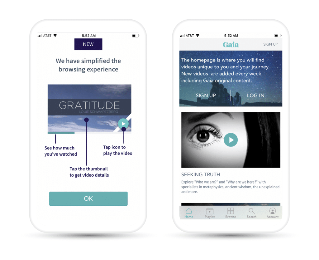
Example: In the screens below, Gaia makes it easy for users to preview what it will be like to get their app up and running by inserting tooltips into the experience, calling out where users can find important features and functionality.
App Onboarding Tactic #2: Save In-Depth Content for Another Channel
Of course, some apps simply have more features and content than can easily be displayed in a few screens.
However, there’s a fine line between sharing a sufficient amount of content and overwhelming a user.
Product managers must be attuned to the primary reasons a user downloaded an app, then address those selectively, rather than inundating users with too much information too soon in the first engagement.
Example: If you need users to fill out an extensive profile or input sensitive information, prompting them to continue their onboarding experience on desktop instead of in the app can improve the user experience and build more trust in your brand.
App Onboarding Tactic #3: Progressive Onboarding Can Do The Heavy Lifting
Another alternative to long onboarding tutorials is giving users enough information to get started, then providing progressive onboarding when new scenarios are encountered.
Making this possible requires more preparation than positioning a full slate of onboarding upfront.
However, as users progress deeper into a product’s functionality, this tactic can be extremely effective.
Example: If a user has never used your app’s picture-taking functionality, introducing specific onboarding screens for photo-taking steps when they attempt to take their first photo is more contextual – and helpful – than including it in their initial onboarding flow.
App Onboarding Tactic #4: Try a Trailer
Just like the desktop experience can do some of the heavy lifting for certain moments in the onboarding process, so can other forms of media.
Short, informative trailers for your app can set the right tone for a brand – and give you a chance to introduce users to the features and functionality they’ll need. Combining the right message with the right overview of your app can be a win for the product team, the marketing team, and your mobile growth.
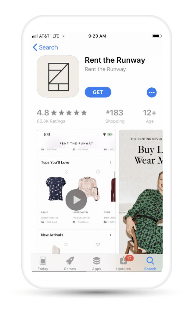
Example: Rent the Runway uses its App Store preview as a form of pre-boarding that provides a welcoming brand moment and helps users evaluate whether or not an app might be for them. Here, users are offered an opportunity to press play and learn more.
Rent The Runway uses a short video trailer to drive app engagement from the App Store as part of its onboarding process.
App Onboarding Tactic #5: Lead With Benefits, Not Features
We’ve touched on many ways to surface the features of your app, but it’s important to make sure you also highlight the benefits to the end user.
It’s tempting to position new, cool features as the lead story. After all, launching new features is a key product management responsibility.
However, when onboarding cross-platform users, benefits are still king. You don’t need to erase all features-driven messaging, but working with your marketing team to surface a benefits-first approach for your app across your web, app, and email campaigns can prove hugely successful and engaging for your users.
One tip: Maintain focus on why users are betting on your solution to meet their needs.
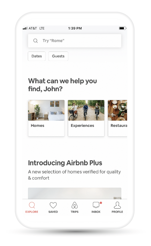
Example: Airbnb raises a simple question that speaks directly to their value prop, engaging its users while putting benefits first.
Airbnb combines benefits and branding to encourage users through the onboarding process.
But, of course, this is just the tip of the onboarding iceberg. There are so many tips, tools, and techniques for effective onboarding that can help you reduce churn and increase user retention and re-engagement.
Ready to find out more about how to make your onboarding experience first-class so users are more likely to be retained and re-engage with your app?
Download Branch’s latest paper, The Product Manager’s Guide to Cross-Platform Onboarding Experiences.

