For those who live outside the United States, Super Bowl LVI (that’s 56, for the majority of us who aren’t fluent in roman numerals) happened yesterday.
Of course, some people really do watch the game itself…but the real reason many tune in to the Super Bowl is for the ads, which now cost at least $6.5m per 30-second slot. This year, crypto was everywhere, and Coinbase is getting most of the follow-up buzz thanks to a quirky commercial that featured nothing more than a simple, color-shifting QR code bouncing around on a black screen.

While the ad itself seems to have confused many viewers (audiences ranked it dead last in the USA TODAY Ad Meter rankings for the game), the results have still been huge for Coinbase: their chief product officer revealed that they saw over 20M hits on their landing page in just a single minute, and Coinbase has dominated the online techy conversation for the last 24 hours since the ad ran.
QR codes are everywhere today, and this is certainly not the first time a QR code has been used as part of an app download campaign on TV — in fact, we’ve seen many similar examples over the past year here at Branch. However, this was likely the first time many consumers in the US have encountered a QR code used this way, and when it comes to mobile apps, not every QR code is created equal.
In this post, we’re going to take a closer look at the Coinbase campaign to see how it was put together (and, spoiler alert, how you can use a mobile linking platform like Branch to create your own).
A step-by-step walkthrough of the Coinbase QR-to-app experience
First of all, it’s worth noting this ad is truly a product of the COVID era. Without the incredible surge in mainstream adoption over the past two years, which has made scanning a QR code almost second-nature, this campaign simply would not have worked.
The Coinbase QR code itself is basic and completely unbranded. This is the kind of code that can be generated by pretty much any QR code tool, including anything from free online services to open-source python modules.
Let’s see what happens when we scan it:
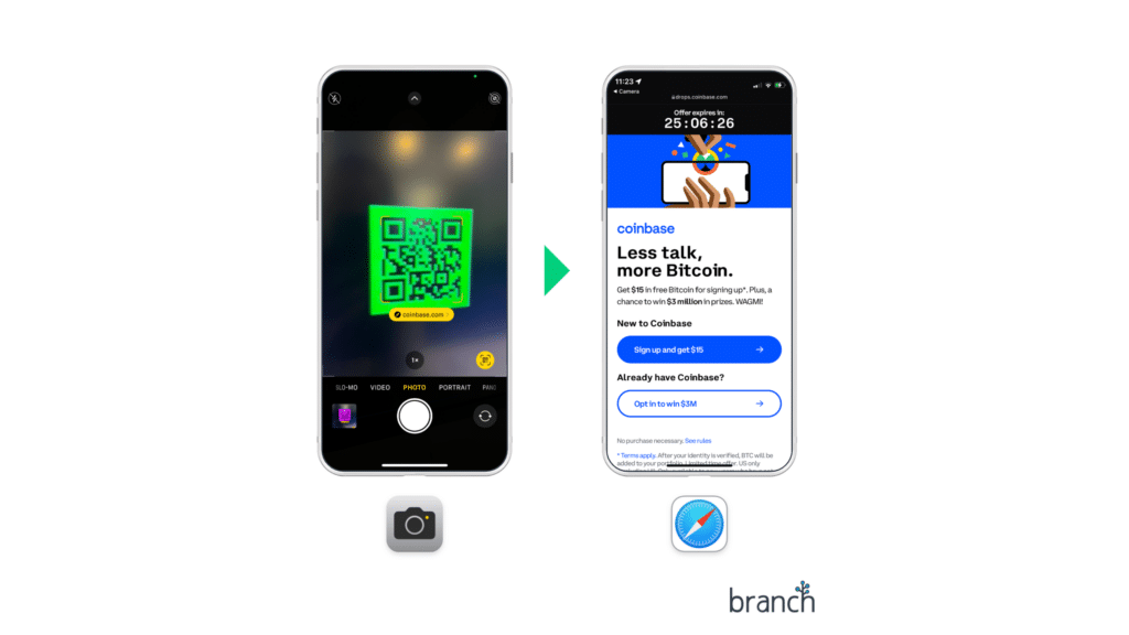
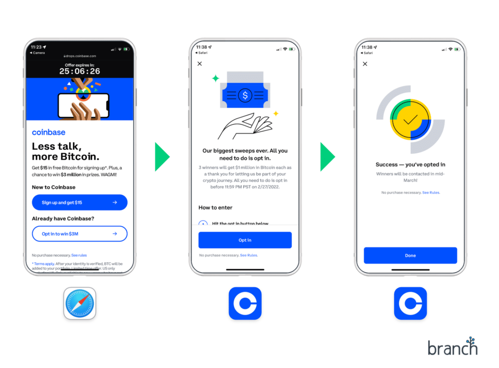
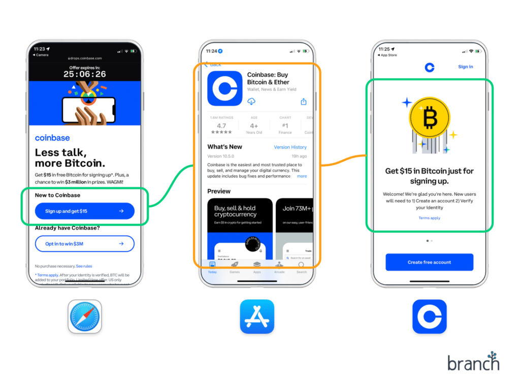
The QR code leads to https://drops.coinbase.com/?qr, a web landing page with two buttons:
- Sign up and get $15.
- Opt in to win $3M.
There are also a few other analytics scripts embedded in the landing page, including Amplitude (product analytics) and Facebook/Google SDKs (conversion tracking and retargeting audiences). The latter will likely be helpful to Coinbase as they look to extend the long tail of conversions from this campaign over the next few weeks.
Now, proceeding with each of the two CTA buttons in turn:
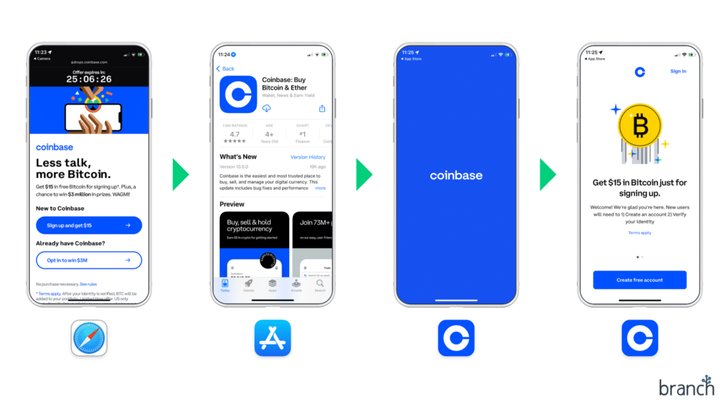
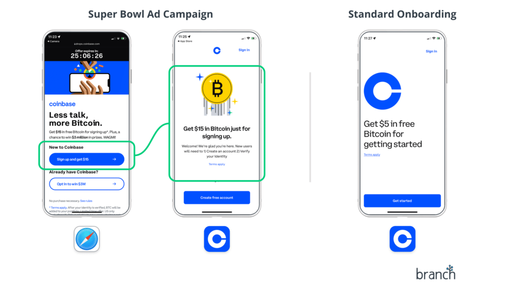
Sign up and get $15. This is the option for new customers who want to sign up and receive free Bitcoin, clearly Coinbase’s primary audience for this campaign. The URL behind this button is a standard mobile measurement partner (MMP) tracking link from AppsFlyer, meaning it is primarily designed for tracking app-to-app install ads, but also capable of being repurposed to measure other marketing campaigns like this one.
Clicking the CTA leads to the App Store. After the user installs and launches the app for the first time, they’re greeted by an onboarding experience that references the same $15 in Bitcoin offer mentioned on the web landing page:
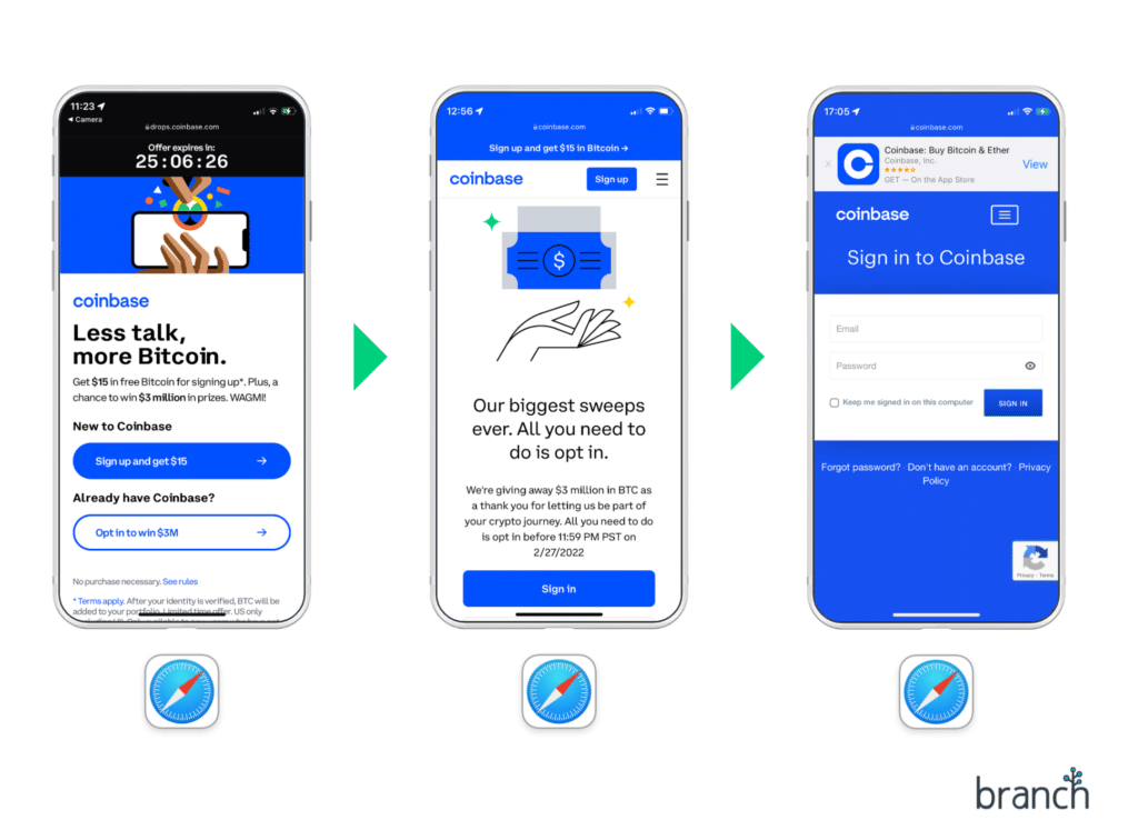
Opt in to win $3M. This is the consolation prize for existing Coinbase customers. If the Coinbase app is not installed on the device, this CTA links to another web landing page where the user can sign in to claim their spot in the drawing:
If the app is installed, the CTA deep links to the sweepstakes entry page inside the app:
(There is also a third, edge case scenario: if the user is logged out of the app for some reason, they are taken to the same $15 offer screen that new users see, and they must sign in before proceeding. The Coinbase app appears to forget where the user was trying to go in this scenario, and brings them to the standard app dashboard after authentication is complete. This kind of deep linking implementation flaw is — unfortunately — not unusual, and can be quite frustrating to users).
What did Coinbase get right with this QR code campaign?
Aesthetic and design
The aesthetic of Coinbase’s ad drives curiosity, and it’s obviously designed to evoke memories of the old bouncing DVD screensaver from 20 years ago:

It’s also cheeky, similar to the very first internet banner ad from 1994:

In other words, it’s simplistic, radically minimal almost to the point of naïvité, and based on a novelty factor that works once or twice (but would wear off quickly if everyone started doing it).
Custom in-app onboarding experience
Coinbase implemented a custom onboarding experience inside the app for this campaign…though it doesn’t specifically reference the Super Bowl campaign. This lack of continuity could impact conversion rates — more on that in the next section.
No unexpected URL wrapping
QR codes generated with online tools often wrap the destination URL in a redirect. This can be useful, because it provides analytics data and the ability to edit the QR code after publication…but these tools often have unexpected limits on the permitted number of QR code scans.
Even worse, many QR code tools are simply not ready for the massive spike of traffic generated by major campaigns like this one, and can quickly become overloaded at exactly the worst time.
Coinbase managed to avoid these pitfalls by using a plain web URL, but at the cost of other benefits (keep reading!)
Where could Coinbase have done things even better?
The QR code itself
The QR code Coinbase used is an example of a ‘dumb QR code’. This means it points to a basic web URL…and that is the only thing it does. From both UX and data usability perspectives, this was probably the biggest missed opportunity of the campaign.
For the UX side, there was no need to take existing Coinbase users to the web landing page at all — if users already have the app installed, they can be sent into it directly from the QR code scan:
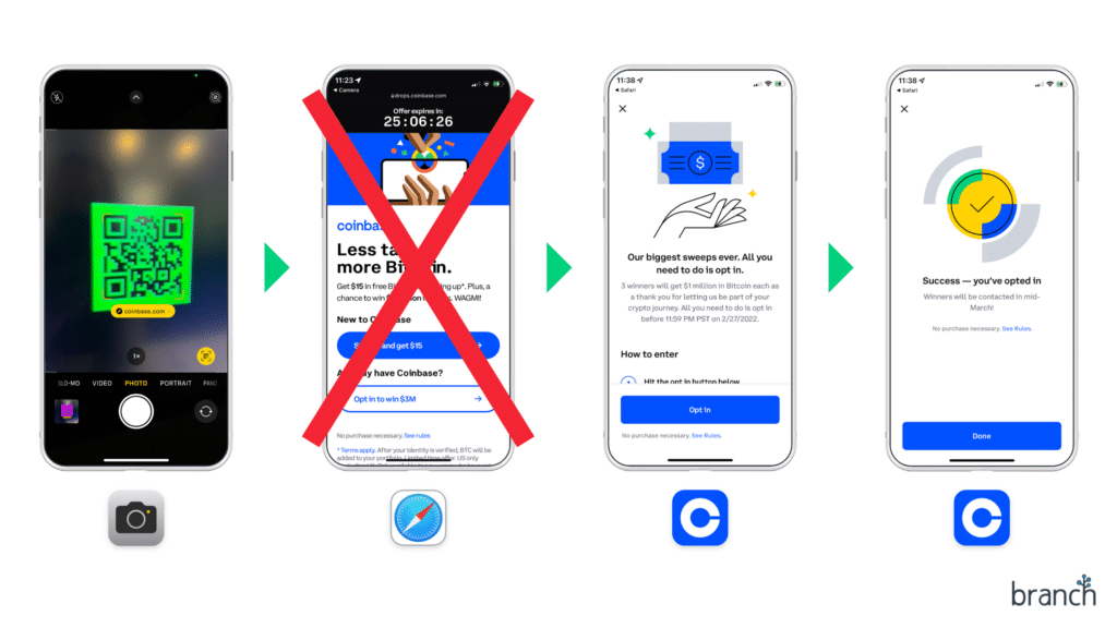
Now, it’s possible that Coinbase made the decision to send existing users through this additional step on purpose, so that they could use visits to the landing page as the baseline metric for their conversion rates, across both users and non-users. However, there’s a better way to implement a user conversion flow like this: taking the baseline metric a level further up, via the link behind the QR code.
This brings us to the second missed opportunity of using a dumb QR code: it has forced the Coinbase team to use a patchwork of different tools, which means they will likely have incomplete data and will need to stitch numbers together across tools to understand the full picture.
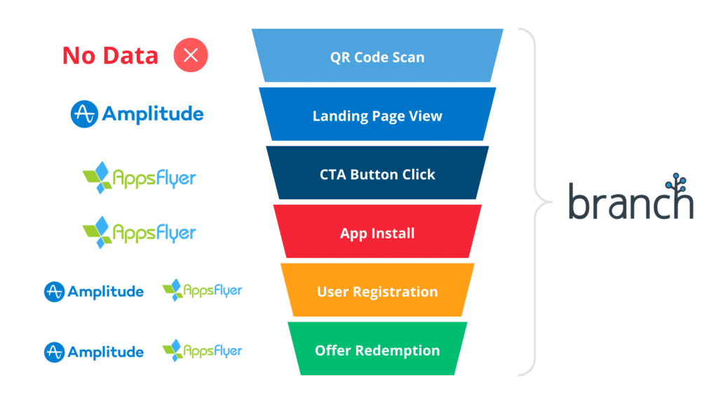
A mobile linking platform (or MLP, such as the one provided by Branch!) is purpose-built for campaigns like this one, and gives everything in a single view:
- Use a Branch-generated QR code to track scans and intelligently route users to the right place based on whether they have the app installed or not.
- Embed the Branch web SDK into your landing page to track pageviews and generate deep links for your CTAs.
- Integrate the Branch mobile SDKs to attribute installs, implement custom onboarding behavior, and connect down-funnel events all the way back to the original QR code.
QR code scannability
While the ad leaves the QR code on the screen for almost the entire 60-second spot (plenty of time for viewers to pull up their phones and scan it), the code itself was still relatively small. This caused scanning issues for many people (TV screens can be hard for smartphone cameras to focus on).
Infrastructure and capacity planning
Once this campaign launched, the Coinbase app crashed within minutes.
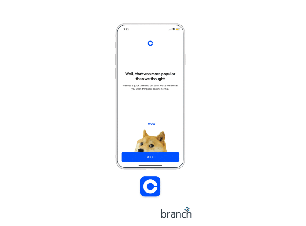
(Though it’s worth noting that this appears to have been an issue with the in-product offer redemption, rather than any of the plumbing of the marketing campaign itself).
The QR code was completely unbranded
With most consumers now familiar with QR codes, QR code phishing is a growing issue. Normally, an unbranded QR might lead viewers to ignore the opportunity to scan, because a basic QR is a door to the unknown (and not always a smart one to walk through, given the risks lurking on the internet).
But in this case, the implied safety of the high-profile event could have helped encourage viewers to see what’s behind that secret door. And with a full minute of screen time, many users might have laughed, paused, and still had time to scan it before it was gone.
However, adding even a subtle Coinbase logo to the QR code in this ad would have increased its credibility, while also providing the added boost of giving those ‘in the know’ about Coinbase a feeling of belonging to the club.
Not using a Custom Product Page
Apple released Custom Product Pages in December, and a massive branded campaign like this is a perfect situation to use one.
A Custom Product Page would have allowed Coinbase to fully customize the App Store page to match the Super Bowl campaign, including Super Bowl-themed content or reminders of the $15 bitcoin special offer, reinforcing again that the new user is on the right track.
Incomplete custom onboarding in the app after download
Coinbase implemented custom onboarding for users from this campaign, which means these users received a different experience than standard downloads. This is a big win, but there are two ways they could have made it even better:
- Reference the Super Bowl campaign directly. This would provide continuity and reassure new users that they’re in the right place.
- Remember the special offer. The Coinbase app does not remember that new users are in the ‘Super Bowl Special Offer’ cohort if they do not sign up right away. This means if the user gets distracted mid-way through the process, they lose their $15 offer and receive only the standard $5 signup bonus.
How did Coinbase do overall, and how can you replicate it for your app?
Though there were a few notable opportunities for improvement, this was a highly successful campaign that boosted the Coinbase app from 186th place to 2nd in the App Store — in fact, the biggest downside for Coinbase is likely the amount of custom work their team needed to do in order to duct tape all the pieces together.
As mobile apps become increasingly integral to our lives (and traditional app-to-app install ads continue to lose efficacy), we’ll almost certainly see more campaigns like this one. Linking on mobile is hard – and especially QR code linking – but the good news is you don’t need to be a duct tape expert to achieve similar results: with a mobile linking platform like Branch, all of the pieces needed for a campaign like this one are available off-the-shelf (and specifically optimized for mobile apps). If you’d like to talk with our experts about how you can pull off an out-of-the-box campaign like this one, please get in touch!
